Jonathan Landy
At VarietyIQ, accurately identifying a garment's color is essential for many modeling applications. However, a quick glance at any single garment image reveals a mix of colors—e.g., consider the many shades of purple in the sweater above. This suggests the question: Are the colors in a "single-color" garment image related in any meaningful way?
By analyzing images, we find that:
- The hue is consistent and well-defined across a garment.
- All colors fall along a single curve in color space.
- Along this curve, brighter areas appear less saturated, as direct light mixes in white. This effect varies by material—glossier fabrics (such as wool) retain less color intensity under direct lighting.
So yes, the sweater above is “purple.” But beneath this simple statement lies a complex reality—garments never really have a single color. Instead, optical physics shifts color with lighting in a precise, garment-specific way, ultimately giving each its own signature "color curve". Details below.
Color theory 101
To describe color effectively, we first need to review some basics.
Our eyes detect color using red, green, and blue (RGB) receptors. Because of this, any human-visible color can be created by mixing just these three base colors. On a computer, this is formalized: each pixel on a screen contains three corresponding light sources—one for each base color—and each color is encoded as a numerical triplet. For example,
represents full-strength red (values range from 0 to 255), no green, and full-strength blue, which together produce purple. When passed a numerical triplet like this, the three lights in a pixel are activated accordingly, generating the desired color.
Now, when all three colors are fully and equally activated, we amazingly perceive white (as Newton showed in 1665, white light is composed of all colors). If they are equally activated but at lower intensity, we see gray. A color appears vivid / colorful then, only when at least one of the RGB receptors is less activated than the others, creating an imbalance. Building on top of these observations, the Hue-Saturation-Value (HSV) model provides an alternative way to describe a color:
- Hue = The "colorful" component, a mix of red, green, and blue, where at least one is fully absent and one fully activated. These hues form the color wheel.
- Saturation = How much white is mixed in (0 = white, 1 = pure hue).
- Value = Brightness level (1 = full intensity, 0 = black).
Compared to the RGB model, HSV more explicitly separates "colorfulness" from brightness, making it easier to reason about when discussing color perception.
Color pickers—a first example
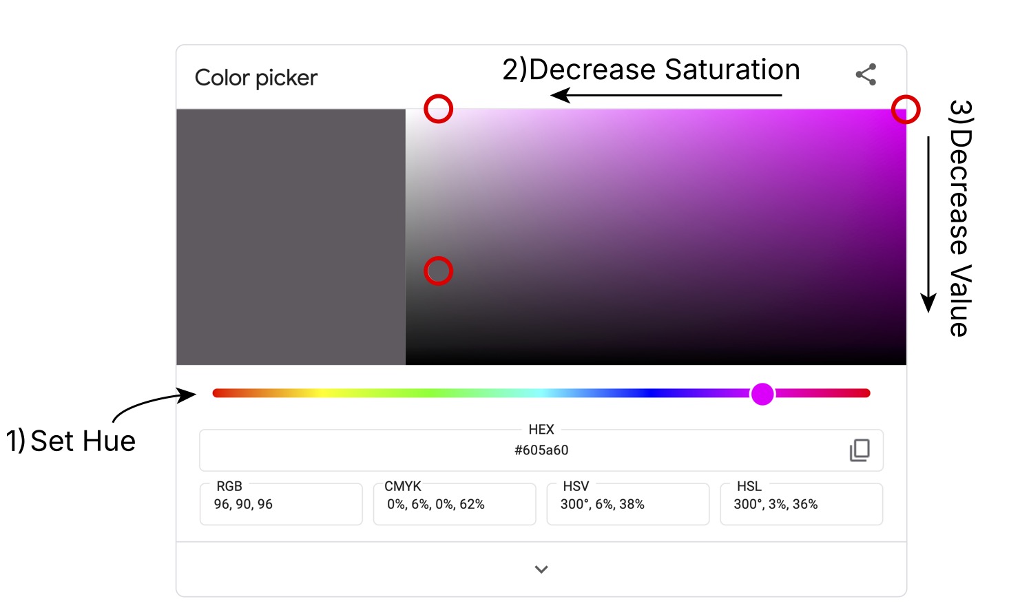
To illustrate HSV in action, I used Google’s color picker to build up one color from the sweater image above. The process follows these steps, shown in the screenshot below:
-
- Select the hue → The sweater's hue is an equal mix of red and blue, with no green present. When we select this from the color wheel (bar) at the bottom, the corresponding color rectangle appears at the upper right. The pure hue appears in the upper-right corner of this rectangle (marked by the red circle in the upper-right).
-
- Adjust saturation → Mixing in white reduces saturation, moving the color to the second red circle.
-
- Adjust value → Mixing in black lowers the brightness / value, bringing us to the final red circle. The resulting color appears in the large color square at left.
In RGB terms, we’ve moved from:
In HSV terms, the transformation is
Here, we've used the color-wheel notation for the hue, with implying we are 5/6-ths of the way around the circle (between red and blue).

Exploring garment color curves
Now that we've introduced the HSV color model and reviewed how to navigate a color picker, we're ready to analyze garment colors. As promised, we’ll examine how color varies with lighting across fabrics. To that end, I’ve selected images of two similar products—both sweatshirts from Taylor Stitch (a VarietyIQ customer).
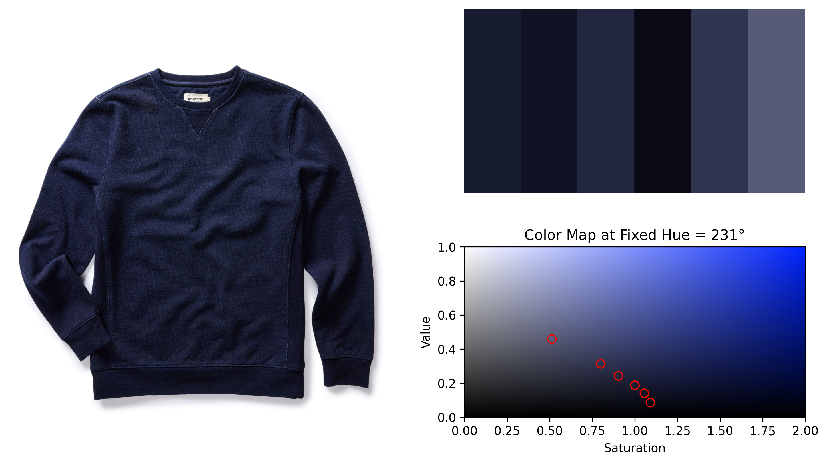
First up is The Apres Crew in Indigo Terry, shown below. At the upper right, we’ve extracted the six dominant colors from the image. Below that, we plot the color rectangle at the sweatshirt’s fixed hue, with red circles marking the six extracted colors. Notice that these colors do follow a smooth curve in this space—this garment's "color curve".
At first, I expected this curve would be vertical, meaning shadowed areas would simply be darker, lower-value / intensity versions of some fixed base color. Instead, brighter areas also have lower saturation—more white is mixed in, meaningfully changing the garment's color. This occurs due to specular reflection: Glossy fibers reflect light like a mirror, bouncing back all wavelengths rather than just the fabric’s inherent color. Under direct lighting, this effect intensifies, adding white light and lowering saturation, as observed.

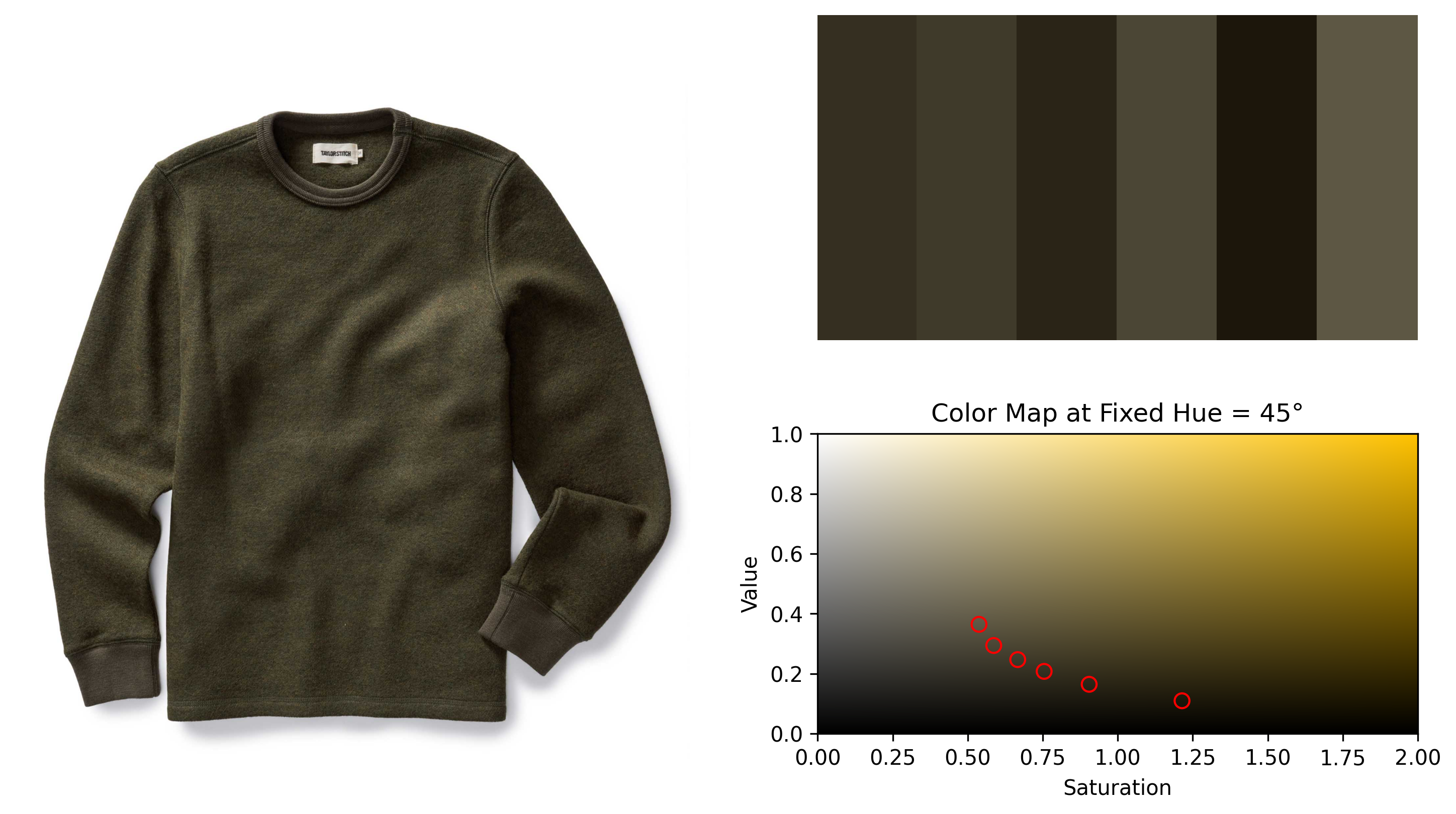
The Apres Crew above is made from cotton. Now, let’s examine a similar wool product: The Evans Crew in Forest Birdseye Wool, shown below. Once again, we’ve extracted the six dominant colors (upper right) and plotted them in the color rectangle at the garment’s fixed hue (bottom right).
A similar pattern emerges: the colors follow a smooth, well-defined curve. However, notice that this curve is less steep than in the cotton example. This happens because wool is glossier than cotton—its brighter areas undergo more specular reflection, causing them to appear whiter than in the cotton case. This is also visible in the garment image itself: The lit-up regions indeed look noticeably whiter than do those in the Apres above.
Two similar products, two unique color curves describing the colors present in their images.

Summary
To summarize: Garment color isn’t as simple as it seems—lighting and fabric properties fundamentally alter the colors we perceive. We can’t ever truly say then that a product has one specific, singular color. Instead, each product is defined by its own signature "color curve", reflecting how light and shadow interact with its fabric. Brighter areas aren’t just more intense—they also appear less saturated as specular reflection mixes in white light. This effect is especially pronounced in glossier materials like wool, where light bounces off fibers more like a mirror.
What a joy to find the physics of perception—shaped by centuries-old discoveries—at play within modern retail applications!
About VarietyIQ
VarietyIQ helps retailers and brands optimize inventory decisions — from forecasting and allocation to pricing and product mix. We combine advanced data science with deep retail expertise to improve efficiency, profitability, and growth.
Need help analyzing your catalog? Get in touch — we’d love to connect.
Thanks to Jaireh Tecarro for creating the header visual for this post.

